
Magnetic summary plots - last 24 hours
An accessible alternate of the summary plot magnetic field values is available here.
An accessible alternate of the summary plot hourly ranges is available here.
An accessible alternate of the summary plot activity levels is available here.
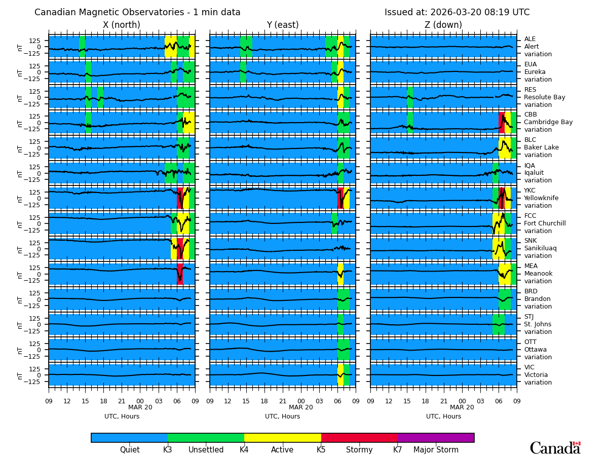
This diagram shows the data for the last 24 hours from the Canadian CANMOS observatories. These data are received by telemetry from each station and must be considered as "raw", or preliminary. For each station, the X (north), Y (east) and Z (vertical down) components of the magnetic field are shown. Stations are displayed starting with the most northerly at the top progressing down the page in decreasing latitude. Universal Time is used, with the current time being at the right side of each plot frame. All frames use the same scale (which automatically adjusts to cover the largest variation), so that the relative strengths of the field at different stations can be readily compared. The background colour changes as the general level of activity varies, with blue for quiet, green, yellow, red, and purple for increasing levels of activity.